"Nesting" they call it. Ohhhhhh, am I nesting. It's funny how one thing leads to another and pretty soon you've changed everything about a space. That's exactly what I've been doing with the nursery and it has been so much stinkin' fun. When we were nesting with Alice, budgets were tight and so was time. We moved into our house a month and a half before she was born and there were too many other things that took priority over making her room cute. Two years later, though, with more time and a budget, I knew what I wanted for Round No. 2.
Enjoy some before and after photos!
before
Our "gray" walls actually turned out to be lavender. Boo.
Not a big deal for Alice, but would definitely need to change if a Baby Boy Hall came along...
Aunt Lynnie made curtains!
And what a chubby, little Alice!!
Overall, not bad, but not great. The purple and gold was starting to bother me, but in a back-burner sort of way, so when Baby Boy turned into a reality, I might have gleefully started plotting a room overhaul that consisted of:
1. new carpet (*insurance provided from the storm)
2. new window (*insurance provided from the storm)
3. new paint
4. new fan
5. new chair (our old hand-me-down lazy boy was unsightly and lacked back support which was a serious bust since I spent so much time nursing there)
6. "new" furniture (read: random hand-me-downs that look cute together)
7. "new" artwork
8. "new" mobile
9. new curtains
10. new layout
We had been saving money for our insurance deductible only to find out a few months later that they already deducted it from the checks they sent so all of a sudden we had some money to play with! For us, it was like winning the lottery. All of a sudden the things I wanted to do could be a reality, so I began to play - and here is what we did!
after
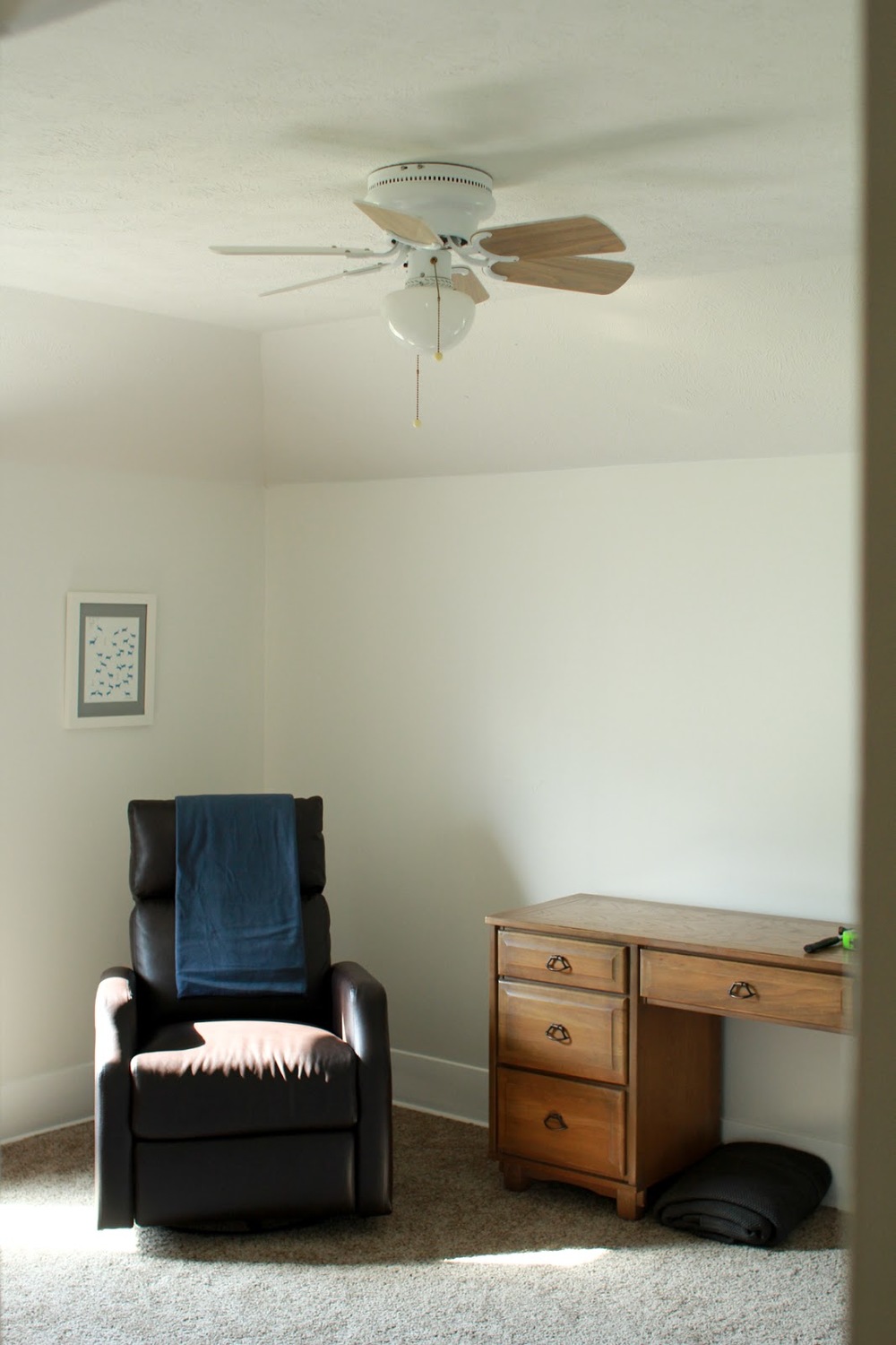
So different! Much classier and inviting. For paint, I wanted to keep it light so I went with Benjamin Moore's White Dove which has a warm tint to it - just enough to distinguish between the wall and the ultra white of the trim. The carpet has a brown tone which is a great neutral. The desk is a hand-me-down that my uncles used when they were little - we just re-purposed it into a changing table. The chair was a deal at NFM. Our criteria was that it wasn't wide and bulky (need good back support), had to rock and recline, and had to be easy to clean (spit-up). Once we tested out this one, I asked the salesman for the pregnant-lady discount and he gave us 10% off! (Always ask for deals - it works 99% of the time and is so worth it. I'm sure mentioning we could pay in cash that day helped, too.) The fan was a Hunter from Lowe's (this one). Here was our fan prior:
Just a little, tiny thing from the 80's. Our handyman friend, Kyle, came over to install it for us and I'm so grateful - it changes the whole look of the room!
took down the blinds and put up new curtains
We bought these two panels from Target and then my sister split them down the middle and hemmed them up for us. Thank you, Aunt Lynnie! You are magical.
Just like with Alice's room, hanging curtains taller than the windows makes the room look so much taller.
"new" art (made from stuff around the studio)
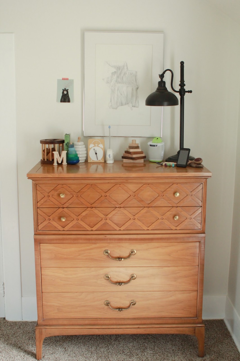
A hand-me-down dresser from the former owners of the house.
Such great bones! Might paint it someday, but for now it is fine.
Now for the art. There are some adorable quotes and prints I've seen floating around Pinterest, but I just can't bear to pay for something I can do myself, so I set off to Goodwill to buy a cheap frame to paint and found this beauty...
If this is hanging in your house and you think it's wonderful, that's great. I'm not knocking personal styles here, I just needed something to upgrade for my own purposes. It was originally $8, but to the saleslady at the front I explained that I just wanted to re-paint the frame and ditch the art for something new and would she please give me a discount? $5. Done!
It took a little disassembling, but once apart and clean, I used some left over spray paint and did 3 light coats. Then I picked out a favorite quote, created a font, and lightly traced it on a piece of poster board from No Frills (that just so happened to be the exact size I needed - what are the odds?). After tracing, I lined it with an ultra-fine black Sharpie. So for $5.50, I made this:
"We were together. I forget the rest." - Walt Whitman
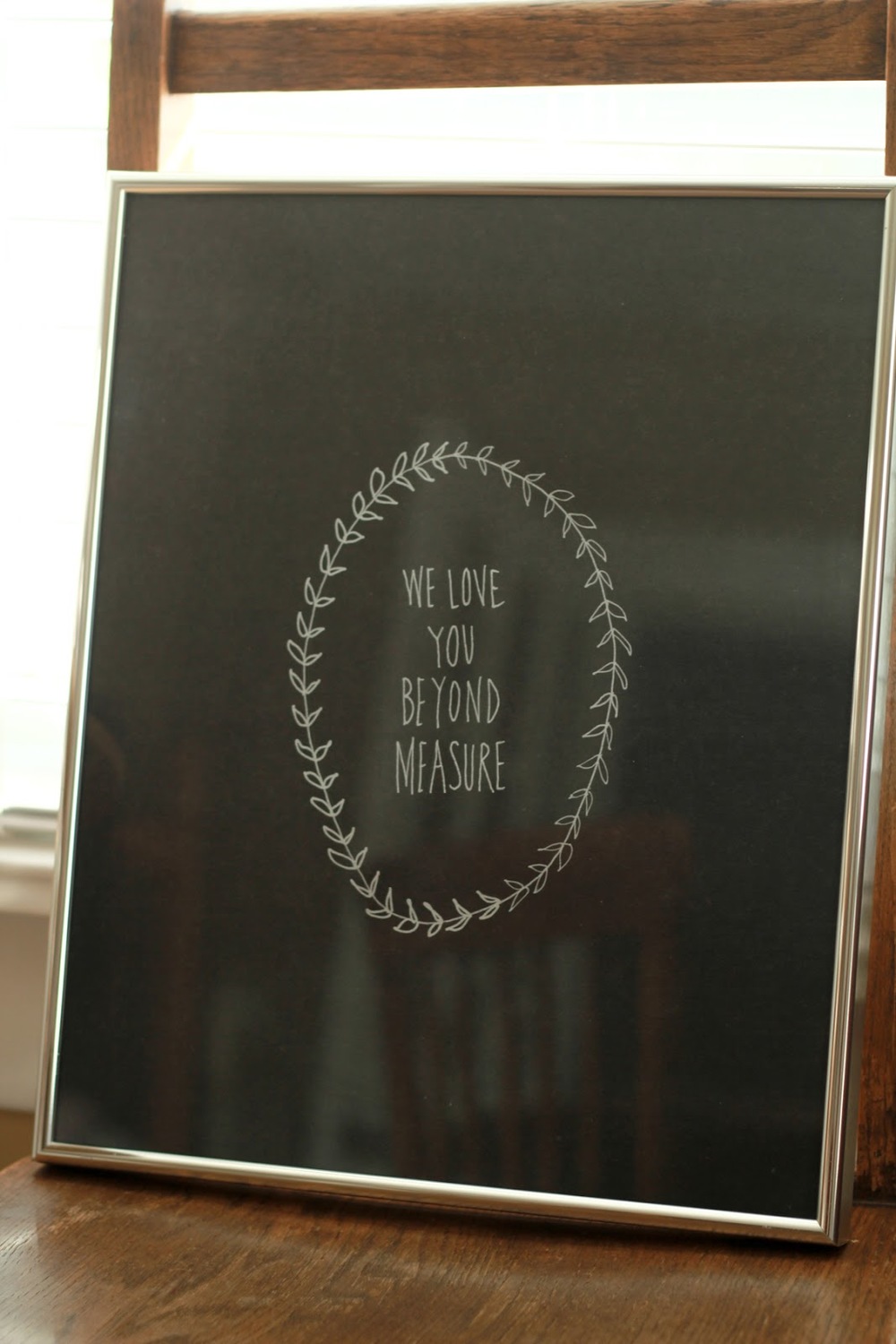
Not too shabby, huh? Simple but graphic and sweet. Another little piece I put together was this...
before & after
I scored 8 of these little frames at the Thrift Shop here in town last year. Since I was buying the lot, I asked for a discount (surprise, surprise) and she said I could have them for half off! $4 for 8 frames with glass - such a great score!
The black paper and silver marker (DecoColor Liquid Silver Extra Fine Opaque Marker) I already had so I just traced out my quote and lined it in silver. Done!
Another little DIY project was the mobile. One of my private art students has a penchant for origami, so I asked her to make me some cranes. I was inspired by this on Pinterest:
Pinterest v. Heather
I used the same set up as the butterfly one I made for Alice and simply replaced the butterflies with strung up cranes...
fresh and fun!
before
after
I'd say it's an improvement.
It feels so good to have the room ready, his little clothes folded and put away, and his cloth diapers stocked.
That's the nursery, folks! The only thing missing now is Baby Milo...


